60 search results
(0.007 seconds)
- Mia's Scribblings ~ - 100% free

- Mia's Scribblings ~ - Unknown license

- Miau by Cuchi, qué tipo,
$5.95 “Miau” is a display typeface designed by “Cuchi, ¡qué Tipo”! (Hey, what a type!”). Its name comes from the onomatopoeia of "Meow" in Spanish, and it is only to be used for letters or single words. It is built from the basic skeleton of cursive script letters, and its origin and main concept is based on experimenting with shapes that play the limit of readability. Being a variable format typeface, we have from the thinnest and lightest version ("Hiss"), to the thickest, dense and compact ("Purr"), passing through the average ("meow"). The final result of this experimentation is defined into a very contemporary typeface with a geometric, modular and “no-terrestrial” flavour. It aims to be a representation of the times we live about typographic design, a whole explosion of implausible experiments and formals researches.
 - Crippled Font by Ingrimayne Type,
$9.00 Its name, CrippledFont, might lead you to think that this font was missing important characters. It is not. Rather it is a letterbat font composed of crutches and canes. It is caps only, with the lower-case keys having an alternative set of capitals. It has an extensive set of accented letters that will support most European languages.
 - Triple Lemon by Reyrey Blue Std,
$12.00 Triple Lemon is fun and charming hand-drawn typeface. This typeface can add more fun and happiness in your design. It can be used to create a beautiful inscription for t-shirts, children's books, branding, small business, book covers, stationery, marketing, blog, magazines and more. All characters of this font supported PUA encoded. Features : · All Uppercase and Lowercase · Number & Symbol · Supported Languages · Stylistic Alternates · PUA Encoded
 - Triple Shots by Maulana Creative,
$14.00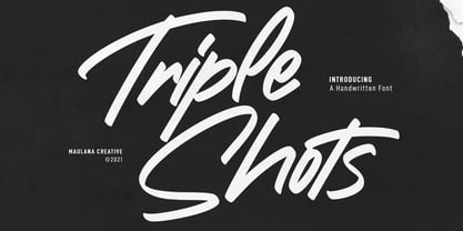 Triple Shots is a casual handwritten display font. With slanted bold felt tip stroke, fun character with a bit of ligatures and alternates. To give you an extra creative work. Triple Shots font support multilingual more than 100+ language. This font is good for logo design, Social media, Movie Titles, Books Titles, a short text even a long text letter and good for your secondary text font with sans or serif. Make a stunning work with Triple Shots font. Cheers, MaulanaCreative
 - Sweet Mia by Angele Kamp,
$24.00 Sweet Mia is a playful modern calligraphy font with a dancing baseline. This sweet font has nice smooth lines and is perfect for crafters and cutting machines. Sweet Mia will look gorgeous on cards, mugs, quotes, logos and all your other lovely projects.
 - Mia Pets by 10four,
$9.00 Mia is a 1 year old. She likes animals. But not just any old barnyard variety animals, she likes cute and fun, pseudo-animals that nobody else knows about. Now she is willing to share her favorite “pets” with the world in this exclusive symbol font designed by 10four. Originally conceived as wall graphics for Mia's bedroom, Mia Pets has been expanded to include 62 distinct icons. A collection of friendly creatures, now set free from Mia's bedroom and ready for whatever mischief you can find for them... great for wall vinyl, web graphics, or T-shirt graphics!
 - Mia Mano by Kate Brankin,
$32.00 Based on designer's own handwriting, Mia Mano is a decorative display typeface ideal for headlines, logos, magazines, posters and short text.
 - Mia Love by Dhan Studio,
$20.00 Mia Love is a special brush font designed to look bold, with a perfect texture, suitable for today's designs. Perfect for use in design titles such as invitations, signboards, book titles, stationery designs, quotes, branding, logos, greeting cards, packaging designs, posters, and more.
 - Triple Condensed Gothic by Red Rooster Collection,
$45.00Based on an early wood type design. An original creation. - Triple Condensed Gothic by BA Graphics,
$45.00A triple condensed gothic based on the letter form of Franklin Gothic. Great for fitting a lot into a small space. With its condensed and extra bold appearance it makes a great headline face. - OL Franklin Triple Condensed by Dennis Ortiz-Lopez,
$30.00 - M8T Mamma Mia by moon8ype,
$19.95 The bigger the better! M8T Mamma Mia is a broken Bodoni inspired serif font whose each character has been handdrawn. Hundreds of strokes build this rough, yet soft font. It is perfect for titles, especially in large scales. Using it on chalkboard backgrounds you will realize the inspiration of chalk-board-writing.
 - Exus Pilot - Personal use only

- P22 Mai Pro by IHOF,
$39.95 Mai Pro is a new transitional antiqua that features ligatures, smallcaps and full Central European support. Mai's classic design is understated enough to be used for long running text applications yet includes unique characters suitable for design purposes. It is the Norwegian name for the month of May.
 - Original Taste by Arttype7,
$12.00 I hope you are very happy today. we want to introduce our newest font, which we named `` Original Taste font ''. This font is a very bold bold cript font and has cool alternets and swashes. original taste font. This font has a taste, old, modern and unique.
 - PR Valknut by PR Fonts,
$6.00 This font includes the symbols Valknut, Triple spiral, Triquetra, and Horn Triskelion, associated with Odin, and ancient Norse and Celtic cultures. Each of these symbols is presented in outline and solid forms, and in vertically and horizontally mirrored forms. For text, use it with PR-Viking.
 - Compressed Wood JNL by Jeff Levine,
$29.00 Two word examples (“nice” and “bud”) from the J.G. Cooley & Co.’s Specimens of Wood Type catalog for the typeface ‘Roman Triple Extra Condensed Fifty Line’ offered only seven letters to work with. Despite this lack of characters, it inspired Compressed Wood JNL, which is available in both regular and oblique versions.
 - Belle Epoque Stencil JNL by Jeff Levine,
$29.00 An old ad for Cointreau Triple Sec Liquor featured a bolder variant of the lettering style found in a set of vintage tin stencils that were the model for French Stencil JNL. This is now available as Belle Epoque Stencil JNL, in both regular and oblique versions. “Belle Epoque” means “beautiful era” in French.
 - Arya by TipoType,
$19.90 Arya is a display typeface, based on Roman proportions. It has three versions, differentiated by the amount of the drawn lines. Single is solid. Double is sturdy but light. Triple is versatile and includes alternatives. They can be combined in layers. Capsule versions (White and Black) are designed to do quick, simple and elegant labels.
 - Arya Rounded by Underground,
$19.90 Arya Rounded is a display typeface, based on Roman proportions. It has three versions, differentiated by the amount of the drawn lines. Single is solid. Double is sturdy but light. Triple is versatile and includes alternatives. They can be combined in layers. Capsule versions (White and Black) are designed to do quick, simple and elegant labels.
 - Phat Boi by Comicraft,
$19.00 Word up! DJ Dongboi and triple threat "JG" Roshell has been bustin' out for all the young font gunnahs out there. He bein' crazy, givin' out the love and non-stop dope moves... You feel it? Be showin' ya respect and holla at the Phat Boi an' y'all be cool. Aiiiigggghhht?! Phatboi is Da Next Big Thang! Stay bent.
 - Bizmo by Eko Bimantara,
$24.00 Bizmo font family is meant for display, it's characteristic is in it's wide letterform which is suitable for use in large or long spaces. Bizmo consist of 9 weight with each matching obliques. Several uppercase glyphs can be stretch wider by double or triple typing the letter and using discretionary ligature. It's contain 420 glyphs which covered broad latin languages.
 - Automoto by Device,
$39.00 Automoto is built from a limited number of curved and straight segments that have been flipped and rotated. It has an extensive set of two- and three-letter ligatures that form a triple ribbon resembling a model car racetrack. For clarity, some character combinations were excluded as they proved to be ambiguous in context. The upper- and lowercase characters can be freely intermixed according to taste.
 - Khamai Pro by DBSV,
$30.00 Khamai Pro is a first attempt at writing a monoline main feature of the curves. Completed after 17 months with many design twists,and also an attempt to provide a different visual design and style as Staccato: (dashed line) Rail: (double line) and Tribe: (triple line). This series of 16 fonts with 625 glyphs each includes true italics and supports Latin, Greek and Cyrillic.
 - Man Of Tomorrow by Comicraft,
$19.00 He's a man of character; a Man for All Seasons. He upholds the values of Truth, Justice and the American Way and he's never averse to a slice of Ma's homemade apple pie. He's not a man of yesteryear, nor a man caught in the here and now. He's a human being of great honor, a citizen of the world -- a Man of Tomorrow!
 - Trilight by Pelavin Fonts,
$12.00 Trilight is a result of my fascination (obsession?) with how the appearance of a typeface can impact on the tactile as well as visual sense to strengthen and guide its imapct. It consists of simple block characters with a triple highlight to give the effect of dimension. The Trilight family consists of both highlighted and solid characters to provide a two color display without the need to convert characters to outline.
 - Sadina by NumidiaType,
$29.00 Sadina™ is the first font family in Sadina's series, based on geometric modernism with a classic touch. Designed with triple thicknesses to build a beautiful mix between modern humanist style, contrast, and classic sense, it provides support for double linguistic zone scripting in the world, depending on "Western European and Cyrillic" languages. It supports Professional Opentype features and supports a wide variety of alternative letters and styles for scripting and an attractive titling.
 - "Mia's Scribblings ~" is an enchanting font that feels like whispers from a fairy tale. It's as if you've stumbled across a secret diary, pages fluttering with the thoughts and daydreams of a whimsic...
- Raliscka by Maulana Creative,
$12.00 Raliscka is a modern casual cript font, With a high contrast stroke clean and fancy characters. It has Opentype features of ligatures, makes it a perfect choice for branding and digital designs. Use this font for logos, social media, websites, blogs, instagram, social media, business cards, branding, and more! Raliscka font support multilingual more than 100+ language. and good pair for your secondary text font with sans or serif. Make a stunning work with Raliscka script font. Cheers, MaulanaCreative
 - Oscar by Pelavin Fonts,
$25.00 Inspired by the elegance and sophistication of Hollywood's Golden Era, Oscar is a lyrical nod to the pinnacle of cinema achievements, the Academy Awards. Its slim, graceful features are accentuated by undulating triple waves. Delicate yet study, it will handily support messages both solemn and joyful. Use Oscar when you wish to convey a sense of celebration and prestige, a reference to the era of Art Deco and the 1920s or, a feeling of grace and ceremony.
 - Jownsey by Maulana Creative,
$12.00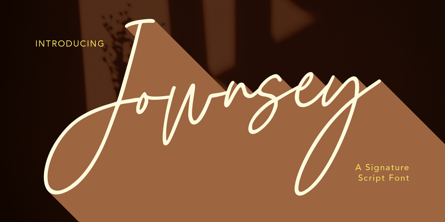 Jownsey is a casual signature cript font, with a light mono-line stroke, slant and fun character. It has Opentype features ligatures of character, To give you an extra creative work. Jownsey signature script font support multilingual more than 100+ language. This font is good for logo design, Social media, Movie Titles, Books Titles, a short text even a long text letter and good for your secondary text font with sans or serif. Make a stunning work with Jownsey font. Cheers, MaulanaCreative
 - Victoria Rogers by Rillatype,
$20.00 Proudly introducing, Victoria Rogers! Victoria Rogers is a special font that crafted carefully with heart and aimed to achieve the purpose of this font to be used as an elegant editorial font, but you can use it for anything you want! This font is special because the uppercase and lowercase have different style, uppercase with feminine feel with swash, and lowercase with thin and crips elegant display serif, mix them both and voila, you have an elegant design instantly!
 - CA Moskow has a plan by Cape Arcona Type Foundry,
$20.00 Inspired by an old Russian book about Moscow’s plan to take over the world, this font was designed to give digital prints the taste of hand lettering. It’s vivid outlines and slight differences in boldness between characters give it an accurate and realistic imperfect letterpress look. It works amazingly well as a text font in small sizes and shows it’s crippled outlines only at larger sizes. »CA Moskow has a plan« has got an extensive character-set including Russian Cyrillic, the Russian Rubel and the Turkish Lira sign. Although it includes kerning, for a full simulation of letterpress print and cold-war feeling we recommend to turn it off.
 - Beautifully Delicious by My Creative Land,
$29.00 Beautifully Delicious is a new font family that combines an elegant extended sans serif fonts and a signature script. Both fonts create a harmonious union that can enhance your designs in the best possible way. The family is suitable for graphic design, quotes, branding, all sorts of social media ads, magazines, greeting cards, packaging etc. The script fonts contain more than 1000 glyphs and benefit from OpenType features such as ligatures (including triple-letter ones), swashes and contextual alternates, two sets of capital letters (tall and short) and underline symbols. Sans serif font also contain some stylistic alternates and presented in 4 weights: Thin, Regular, Bold and Black. Hope you enjoy using it!
 - Scillienta by Calligraplay,
$10.00 Scillienta is a considered and exacting handwriting font that includes unique ligatures, characters for multiple languages, and a range of mathematical symbols. Inspired by the condensed, small, skinny handwriting traits I have consistently seen in scientists' handwriting, it exemplifies the effort of trying to write neatly when appearance is not the first priority. Scillienta is well-suited to handwritten notes and labels, school work and professional scribbles. It also works well as handwriting on electronic devices such as iPads and other cases in which handwriting might appear less fluid than usual. Scillienta includes 287 glyphs and 17 ligatures to ensure that common double- and triple-letter combinations retain the true-to-life inconsistencies of real handwriting.
 - Aldo New Roman by Indian Summer Studio,
$45.00 Aldo New Roman (1000+ glyphs, incl. medieval Latin, Cyrillic, some Greek, ornaments, small capitals, nut fractions...) Renaissance antiqua · Venetian types · Venetian serif · Humanist serif · Old style antiqua A modern version of the typeface cut by Francesco Griffo for Venetian printer Aldus Manutius around 1490 AD. Intentionally not the original Griffo / Aldus / Bembo — but the part of the large project on revival and further development (by drawing many additional glyphs, sometimes over 1000) of the 20th century's typewriters’ fonts. Triple pun here :: :: #1 Aldine Roman type; #2 Since it is equalized, modernized version — the parallel to the Times New Roman; #3 He called himself Aldus Pius Manutius Romanus — he was a new Roman during his Renaissance times.
 - MIR Next by Juliasys,
$22.00 MIR Next is a growing multi-script type family best described by the terms “humanist–semi–slab-serif”. Its character set contains Latin and Cyrillic, both extended, as well as Greek, covering more than 100 languages. Strong personality along with consistency between language systems were a basic aim when designing the family. As a result MIR has become a great tool for branding and international identities. A wide choice of symbols and numbers makes it also very useful for statistics, texts about mathematics and the sciences. Serious things are best be said in an unpretentious, relaxed way. MIR gives typography exactly that kind of appearance. Its texts emit a sense of authority but stay easily accessible at the same time. MIR’s name comes from the old Russian word Мир meaning both “world” and “peace” – a unity we will hopefully take for granted sometime in the future.
 - Letteria Pro by Latinotype,
$29.00 A triple threat, Letteria Pro is a typographic trio designed for branding and packaging. With the soul of a broad nib pen and the grace of a brush, it has five weights and a lot of style. In order to achieve a pragmatic contrast between a composition’s communication levels, we have created a mechanical typeface with only capital letters in sans and slab versions that elude to a De Stijl style. Ligatures and swashes provide a plethora of options, including Thin, Light, Regular, Bold and Black weights, while its companions offer a single weight. Together, this Latinotype original covers more than 200 languages within the Latin alphabet. Yet another powerful tool for your arsenal of fonts that command consumer attention.


Page 1 of 2Next page